R语言ggplot2气泡地图实战

目录
在数据可视化中,气泡地图(Bubble Map)是一种直观表现地理信息的方法,既能展示地理位置,也能通过气泡的大小和颜色体现数据的数量和类别。本文将带你用 R 语言 + ggplot2 从零开始绘制一张漂亮的气泡地图。
气泡地图以一个地图轮廓为背景,用附着在地图上的气泡来反映数据的大小。气泡地图可以直观地反应国家或地区的相关数据指标大小和分布情况。
气泡地图的输入通常包含两部分:
- 国家或地区的坐标(经度和纬度)
- 表明气泡大小和颜色的数值变量
获取地图数据
我们使用maps包加载每个国家的边界数据。
|
|
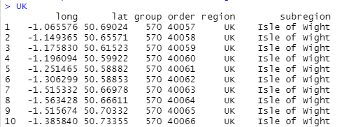
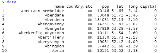
加载英国每个城市的数据:
|
|
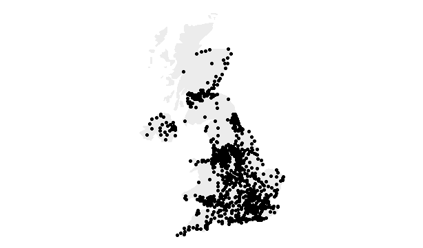
绘制散点地图
加载完所需数据后,我们可以绘制散点地图。用geom_polygon绘制地图,用geom_point绘制散点。
|
|
接下来,我们绘制人口量最大的 10 个城市:
|
|
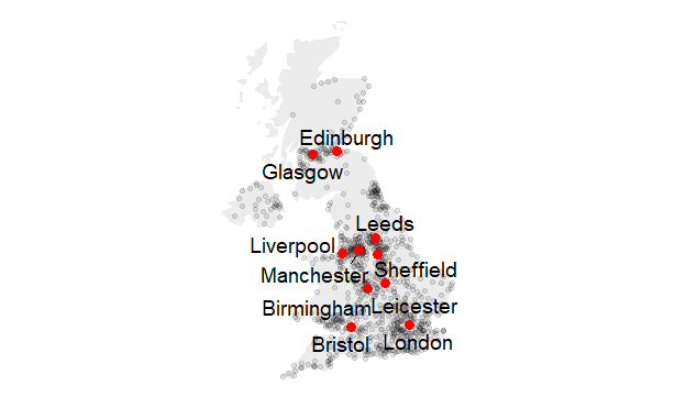
这里使用ggrepel库来避免城市名重叠。
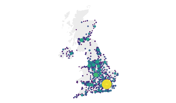
绘制气泡地图
现在我们想让每个城市的人口数与气泡的颜色和大小对应。城市的绘制顺序很重要,建议将最重要的信息显示在顶部。这可以通过在绘制图之前对数据集进行排序解决。
|
|
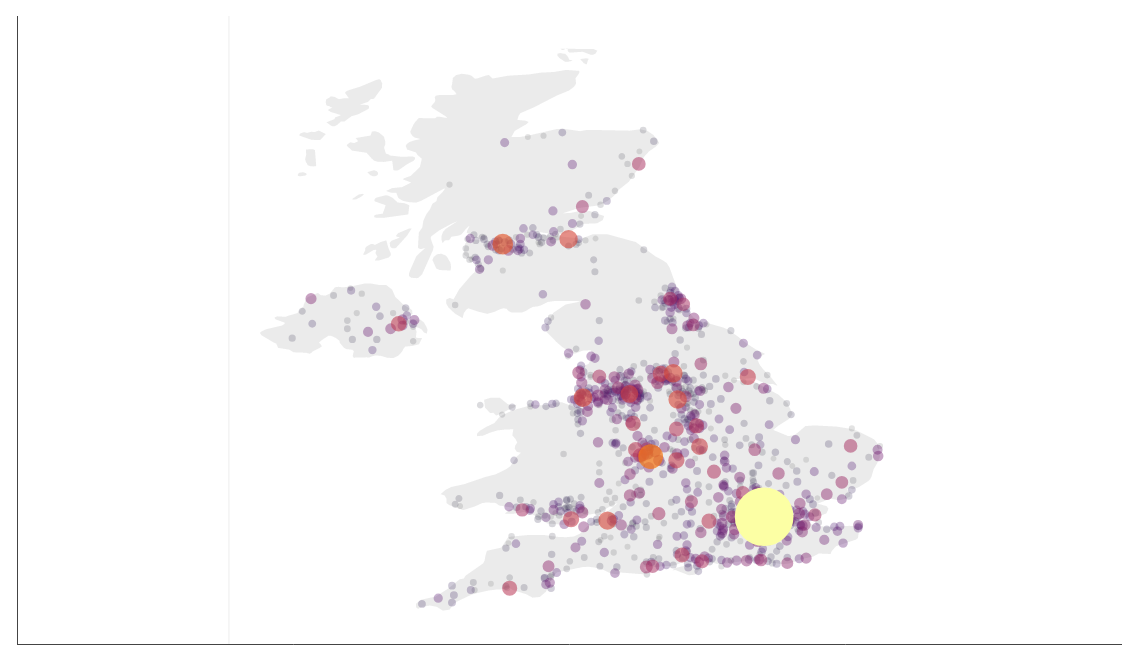
自定义气泡地图
我们可以自定义气泡地图来得到更好的效果。
|
|
交互式气泡地图
最后,我们用plotly包绘制交互式气泡地图。
|
|
小结
本文我们用 ggplot2 成功绘制了带有气泡的世界地图。通过改变气泡的大小、颜色和透明度,可以轻松地传达地理空间分布与数量差异。气泡地图在人口统计、销售分布、地理分析等领域都非常实用。
参考
https://help.aliyun.com/document_detail/55644.html
https://www.r-graph-gallery.com/330-bubble-map-with-ggplot2.html
相关内容
请作者喝杯咖啡!
 支付宝
支付宝
 微信
微信