Matplotlib简明教程

在数据科学和分析领域,图表不仅是展示数据的工具,更是讲故事的语言。Matplotlib 是 Python 中历史最悠久且功能最全面的绘图库。无论你是想画一个简单的折线图,还是需要定制复杂的多图布局,Matplotlib 都能满足你的需求。这篇文章将带你快速上手,学会用代码画出数据的价值。
创建图与图表是很多分析项目中的一个重要步骤,它通常是项目开始时探索性数据分析(EDA)的一部分,或者在项目报告阶段向其他人介绍你的数据分析结果时使用。
matplotlib 是一个绘图库,创建的图形可达到出版的质量要求。它可以创建常用的统计图,包括条形图、箱线图、折线图、散点图和直方图等等图形。matplotlib 提供了对图形各个部分进行定制的功能。例如,它可以设置图形的形状和大小、x 轴与 y 轴的范围和标度、x 轴和 y 轴的刻度线和标签、图例以及图形的标题。更多关于定制图形的信息请查看:https://matplotlib.org/users/beginner.html 。
下面,我们就开始学习一些常见图形的绘制,使用的数据来自The Complete Pokemon Dataset。
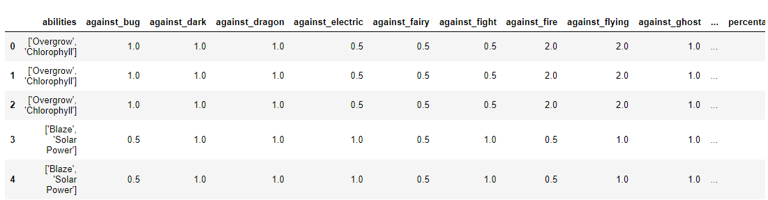
先将数据导入,
|
|
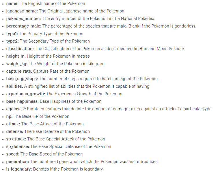
数据每一列的含义如下,
条形图
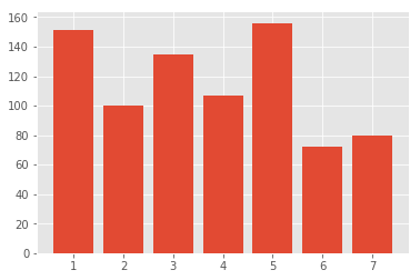
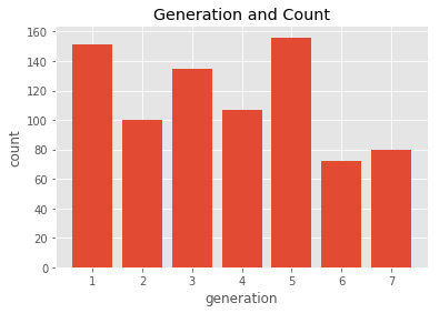
假如我们想查看一下每一代 Pokemon 的数量,并用条形图显示出来,该怎么办呢?
|
|
可以看到如下结果:
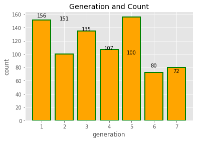
如果我们想添加轴标签和标题的话,加上如下内容即可:
|
|
为了方便起见,我们也可以为每个条加上数值标签,
|
|

|
|
- x: 指定图形横轴坐标
- height: 指定条形图的高度
- width: 指定条形图的宽度
- color: 指定条形图前景色
- edgecolor: 设置条形图边界颜色
- linewidth: 设置条形图边界宽度
更多内容请查看:https://matplotlib.org/api/_as_gen/matplotlib.pyplot.bar.html
知道了上述参数的含义之后,我们就可以对之前的图形进行小小的改动啦!
|
|
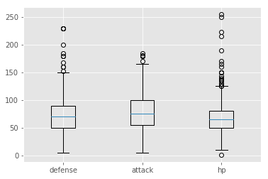
箱线图
箱线图一般用来展示数据的分布(如上下四分位数、中位数等),同时,也可以用来反映数据的异常情况。
|
|
matplotlib.pyplot.boxplot函数详情:
|
|
- x: 指定绘图的数据
- notch: 是否是凹口的形式展示箱线图,默认为非凹口
- sym: 指定异常点的形状
- vert: 是否需要将图形垂直摆放,默认为垂直摆放
- whis: 指定上下须与上下四分位数的距离,默认为 1.5 倍的四分位差
- positions: 指定图形的位置,默认为[0,1,2……]
- widths: 指定图形的宽度,默认为 0.5
- patch_artist: 是否填充箱体的颜色
- meanline: 是否用线表示均值,默认用点表示
- showmeans: 是否显示均值,默认不显示
- showcaps: 是否显示图形顶端和末端的两条线,默认显示
- showbox: 是否显示图形的箱体,默认显示
- showfliers: 是否显示异常值,默认显示
- boxprops: 设置箱体的属性,如边框色、填充色等
- labels: 指定箱线图的标签
- filerprops: 设置异常值的属性,如异常点的形状、大小等
- medianprops: 设置中位数的属性,如线的类型、粗细等
- meanprops: 设置均值的属性,如点的大小、颜色等
- capprops: 设置图形顶端和末端线条的属性,如颜色、粗细等
- whiskerprops: 设置须得属性,如颜色、粗细等
更多内容请查看:https://matplotlib.org/api/_as_gen/matplotlib.pyplot.boxplot.html
折线图
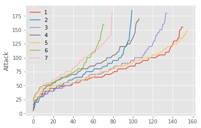
我们不妨查看一下每一代 Pokemon 攻击力的走势,
|
|
|
|
- x: x 轴数据
- y: y 轴数据
- fmt: 格式化字符串
更多内容请查看:https://matplotlib.org/api/_as_gen/matplotlib.pyplot.plot.html
散点图
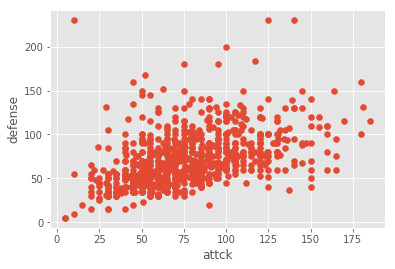
将防御力和攻击力用散点图绘制出来,
|
|
matplotlib.pyplot.scatter函数详情:
|
|
- x: 指定数据横坐标
- y: 指定数据纵坐标
- s: 指定标记大小
- c: 指定标记颜色
- marker: 设置标记样式
- alpha: 设置透明度
- linewidths: 设置标记边缘的线宽
- edgecolors: 设置标记边缘的颜色
更多内容请查看:https://matplotlib.org/api/_as_gen/matplotlib.pyplot.scatter.html
直方图
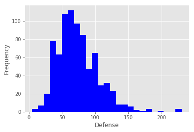
将防御力的分布用直方图绘制,
|
|
|
|
- x: 指定每个 bin 分布的数据,对应 x 轴
- bins: 指定 bin 的个数
- range: 指定 bin 的分布范围
- density: 是否将得到的直方图归一化
- cumulative: 是否绘制累积频数图
- bottom: 指定每个 bin 底部的基线位置
- histtype: 指定直方图类型
- align: 设置直方图的绘制方式,默认为 mid
- orientation: 指定方向,水平或垂直
- log: 是否使用对数刻度
- label: 设置图形的标签说明
- stacked: 是否将图形堆叠
更多内容请查看:https://matplotlib.org/api/_as_gen/matplotlib.pyplot.hist.html
饼图
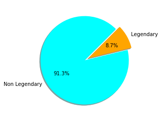
接下来,我们可以看一下幻之宝可梦所占的比例,
|
|
|
|
- x: 指定绘图的数据
- explode: 指定饼图某些部分突出显示
- labels: 指定饼图的标签说明
- colors: 指定饼图的填充色
- autopct: 设置百分比格式
- pctdistance: 设置百分比标签与圆心的距离
- shadow: 是否添加阴影效果
- labeldistance: 设置各扇形标签与圆心的距离
- startangle: 设置饼图的初始摆放角度
- radius: 设置饼图的半径大小
- counterclock: 是否让饼图按逆时针显示
- wedgeprops: 设置饼图内外边界属性,如边界线的粗细、颜色等
- textprops: 设置饼图中文本的属性,如字体大小、颜色等
- center: 指定饼图的中心位置
- frame: 是否要显示饼图背后的图框
- rotatelabels: 是否要让扇形标签跟着扇形角度旋转
更多内容请查看:https://matplotlib.org/api/_as_gen/matplotlib.pyplot.pie.html
如果感觉意犹未尽的话,可以到:https://matplotlib.org/gallery/index.html
学习各种图的绘制。
万一这都满足不了你对可视化的追求的话,可以参考10 Useful Python Data Visualization Libraries for Any Discipline,进行学习。
绘制 NAB 球员出手位置
接下来,我们将提取 NBA 球员投篮数据,然后用matplotlib和seaborn绘制出手位置图。
首先我们导入需要用到的包:
|
|
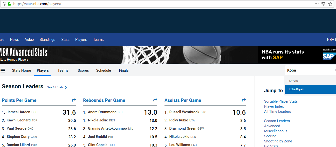
NBA 有一个官方统计网站https://stats.nba.com/,可以在该网站到查到各种统计数据。
为了获取到James Harden在2018-2019赛季的投篮数据,可以使用以下地址:
|
|
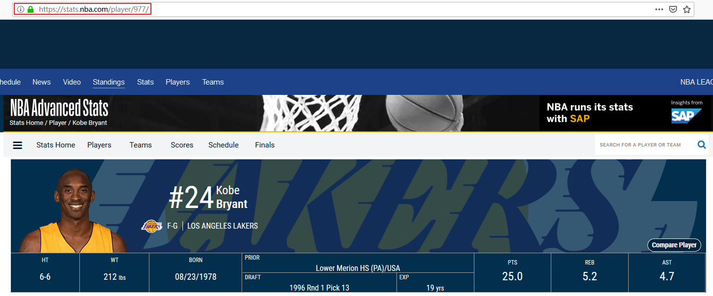
其中player_id指的是球员的 ID,比如James Harden的 ID 就是201935。
每个球员的 ID 都可以在https://stats.nba.com/查到,比如Kobe Bryant, 搜索Kobe Bryant
地址栏中的977就是他的球员 ID
接下来,我们可以使用Requests包请求上述地址获取到数据:
|
|
请求返回的数据是 JSON 格式的,可以用Pandas创建一个DataFrame对象,方便后续处理。
|
|
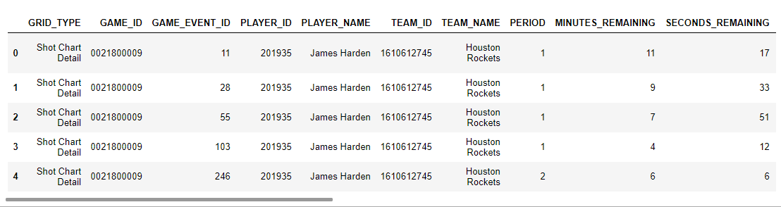
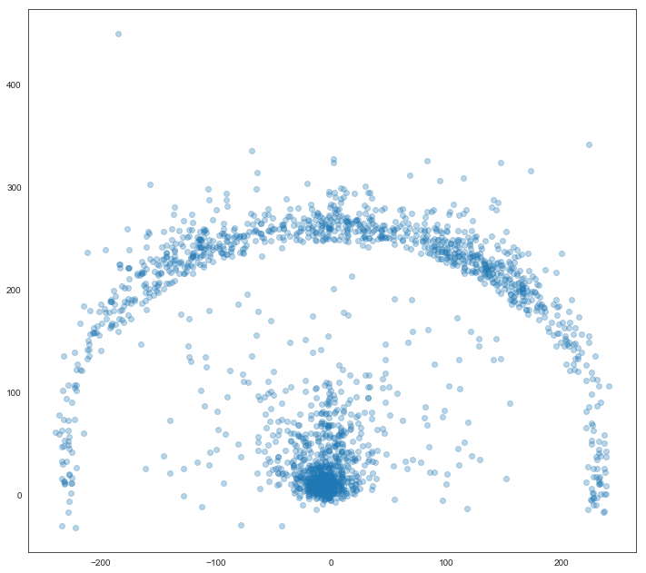
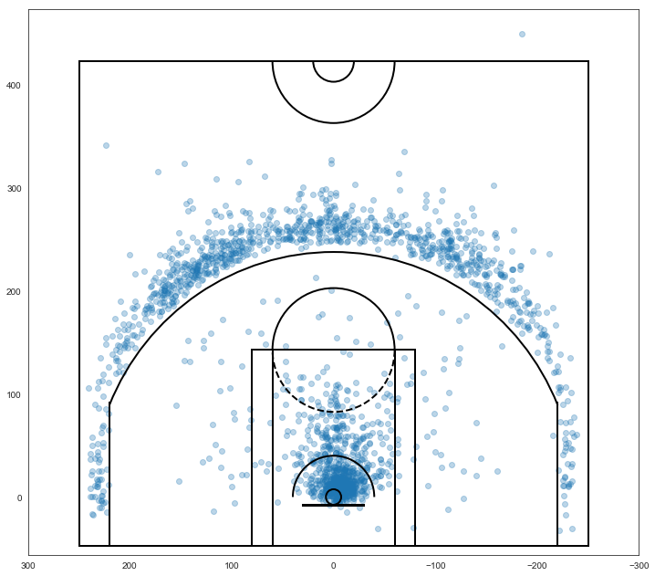
以上便是James Harden在2018-2019赛季常规赛的投篮数据。其中LOC_X,LOC_Y就是出手位置,可以用散点图将其绘制出来:
|
|
为了更加直观,我们用以下代码把球场绘制出来:
|
|
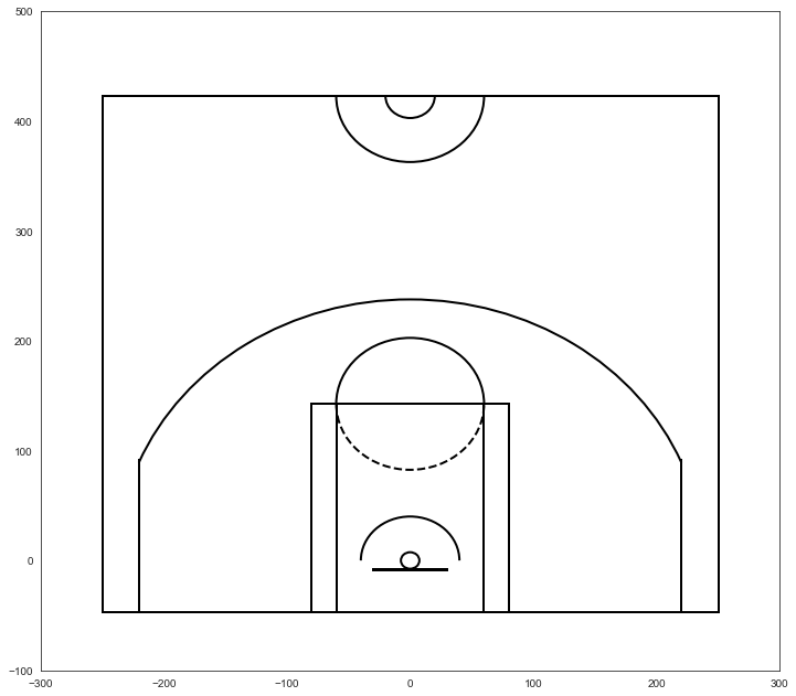
绘制球场
|
|
将出手位置也加进去
|
|
使用Seaborn的jointplot绘制图像
|
|
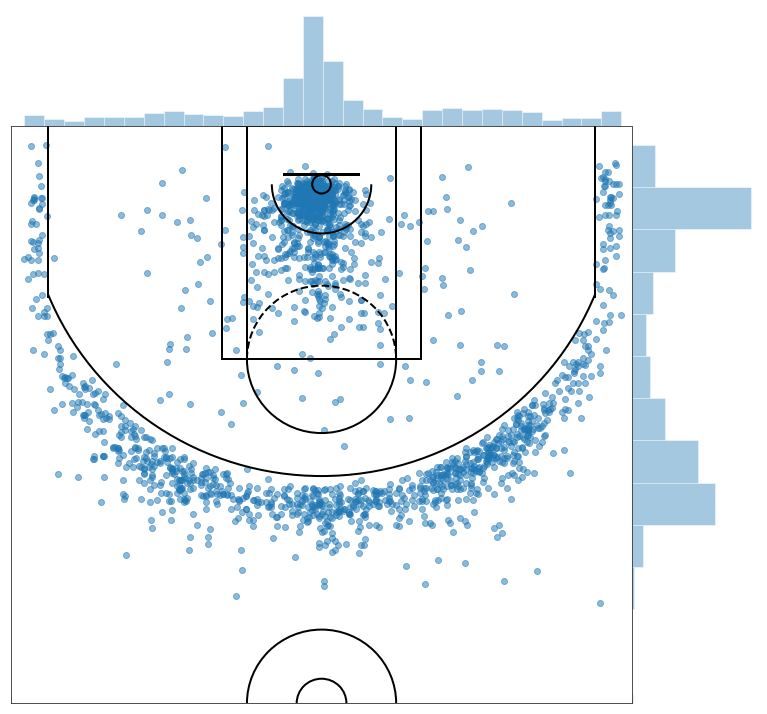
从中可以看到其出手位置的分布情况。
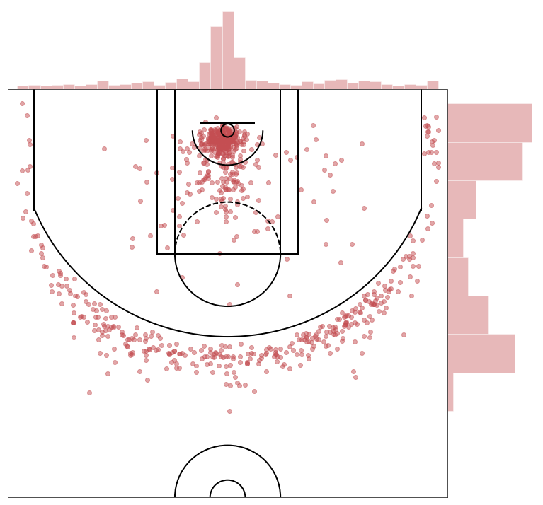
值得注意的是,shot_df中有一列SHOT_MADE_FLAG代表的是是否投中(1 为投中,0 为未投中),我们可以查看一下投中出手位置的分布:
|
|
参考
- https://liam.page/2014/09/11/matplotlib-tutorial-zh-cn/
- https://blog.csdn.net/ScarlettYellow/article/details/80458797
- https://wizardforcel.gitbooks.io/matplotlib-user-guide/content/
- https://blog.csdn.net/qq_34337272/article/details/79555544
- https://matplotlib.org/tutorials/index.html
- How to Create NBA Shot Charts in Python
相关内容
 支付宝
支付宝
 微信
微信